Formula 1 Data
Grid Guy
gridguy.racing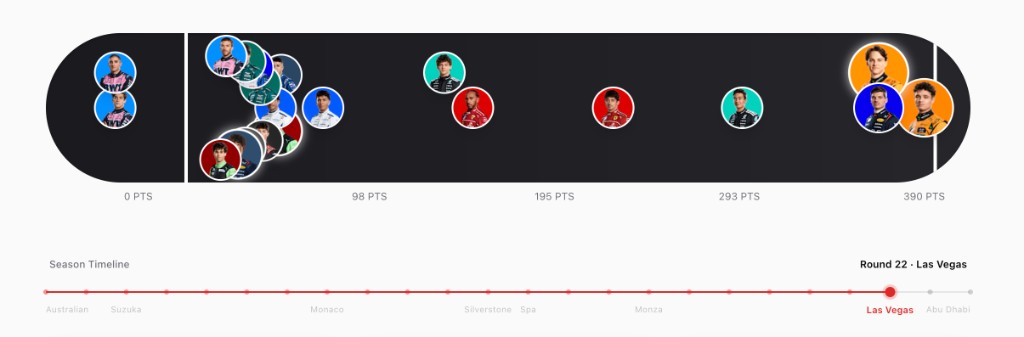
F1 race data is surprisingly hard to make sense of at a glance. The official app buries you in tables, and most fan sites optimize for density over clarity. Grid Guy started from a simple question: what if standings were built to explore?
The interesting challenge was figuring out what casual fans and stats-obsessed viewers actually need from the same interface. A first-time viewer wants to know who's winning and by how much. A serious fan wants to trace momentum shifts across a 23-race season. I ended up designing layered visualizations that surface the headline at a glance but reward digging deeper — hover states that reveal race-by-race breakdowns, and comparison modes that make rivalries tangible.
Built with
Next.js, TypeScript, Recharts, Ergast API
What I was solving for
Making dense seasonal data feel explorable rather than overwhelming. Real-time updates during race weekends without sacrificing load performance.
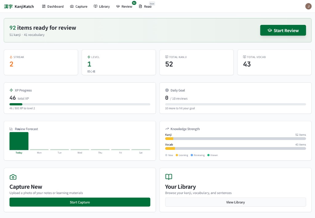
I started learning Japanese and quickly hit the kanji wall — thousands of characters, each with multiple readings, and most study tools that treat them like a spreadsheet to grind through. Kanji Katch came from wanting something that felt more like play than punishment.
The tricky part was balancing game mechanics with genuine retention. Spaced repetition works, but only if people actually come back. So I focused on making sessions feel snackable — one tap to start, no setup, no guilt if you only do five minutes. The visual-first card design lets you recognize characters by shape and pattern before you've consciously memorized the reading. It's the kind of thing where you realize you've learned 50 kanji and it didn't feel like studying.
Built with
Next.js, TypeScript, Tailwind CSS
The interesting bit
Designing a review loop that's fast enough to feel casual but structured enough that you're actually retaining. The spaced repetition algorithm adapts to how well you know each character.

Specialty coffee people care deeply about where their beans come from — the farm, the region, the altitude, the processing method. But there was no good way to see your own coffee journey geographically. Brewatlas gives you a personal map of everywhere your coffee has come from.
The design challenge was making data entry feel effortless enough that people would actually do it. Coffee logging apps exist, but most of them feel like filling out a form. I wanted the primary interaction to be the map itself — tap a region, log a brew, watch your atlas grow. The statistics and roaster tracking are there for people who want to go deep, but the emotional hook is watching pins appear across continents and realizing how far your morning cup has traveled.
Built with
React, Mapbox, Node.js, PostgreSQL
The interesting bit
Designing for a niche audience with very strong opinions about data accuracy. Every UX decision had to earn trust from people who know exactly where Yirgacheffe is.